
Rasdaani
Rasdaani is a family-run pickle brand. They use traditional recipes passed down through generations but they were missing a lot, while not being a part of digital market. They did not had an existing labels and didn’t differentiate between flavours. My task was to create a brand system that honoured Rasdaani’s legacy while appealing to contemporary consumers.
Approach
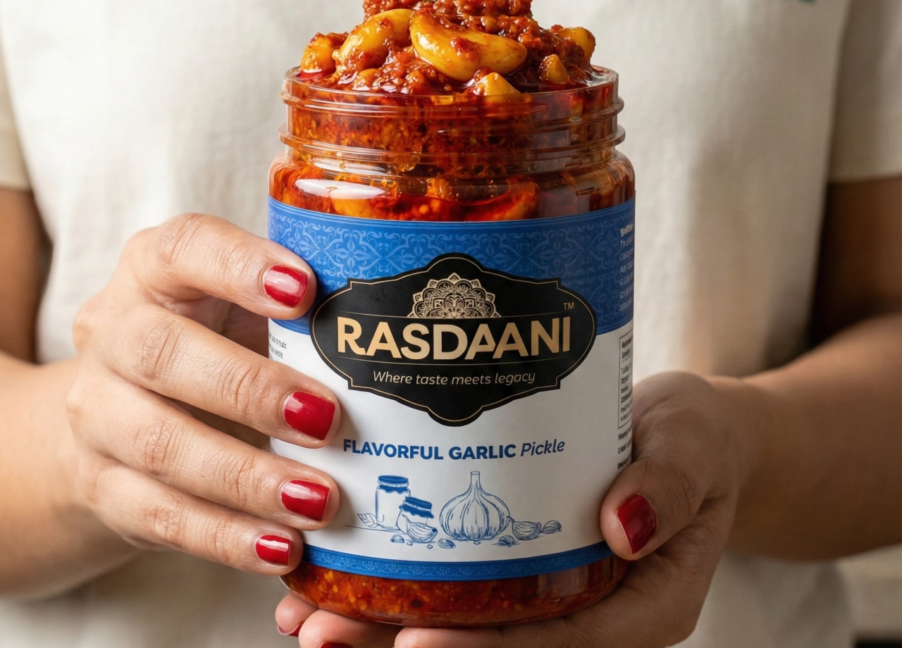
Research & Storytelling: I explored motifs found in traditional Indian crafts and combined them with modern type. The new label features intricate patterns around the logo and the tagline “Where taste meets legacy,” which encapsulates the brand’s promise.
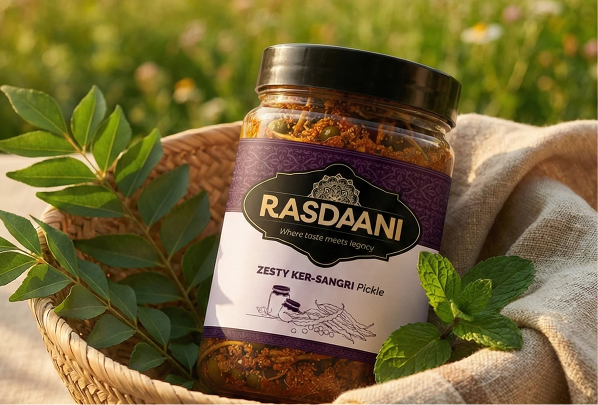
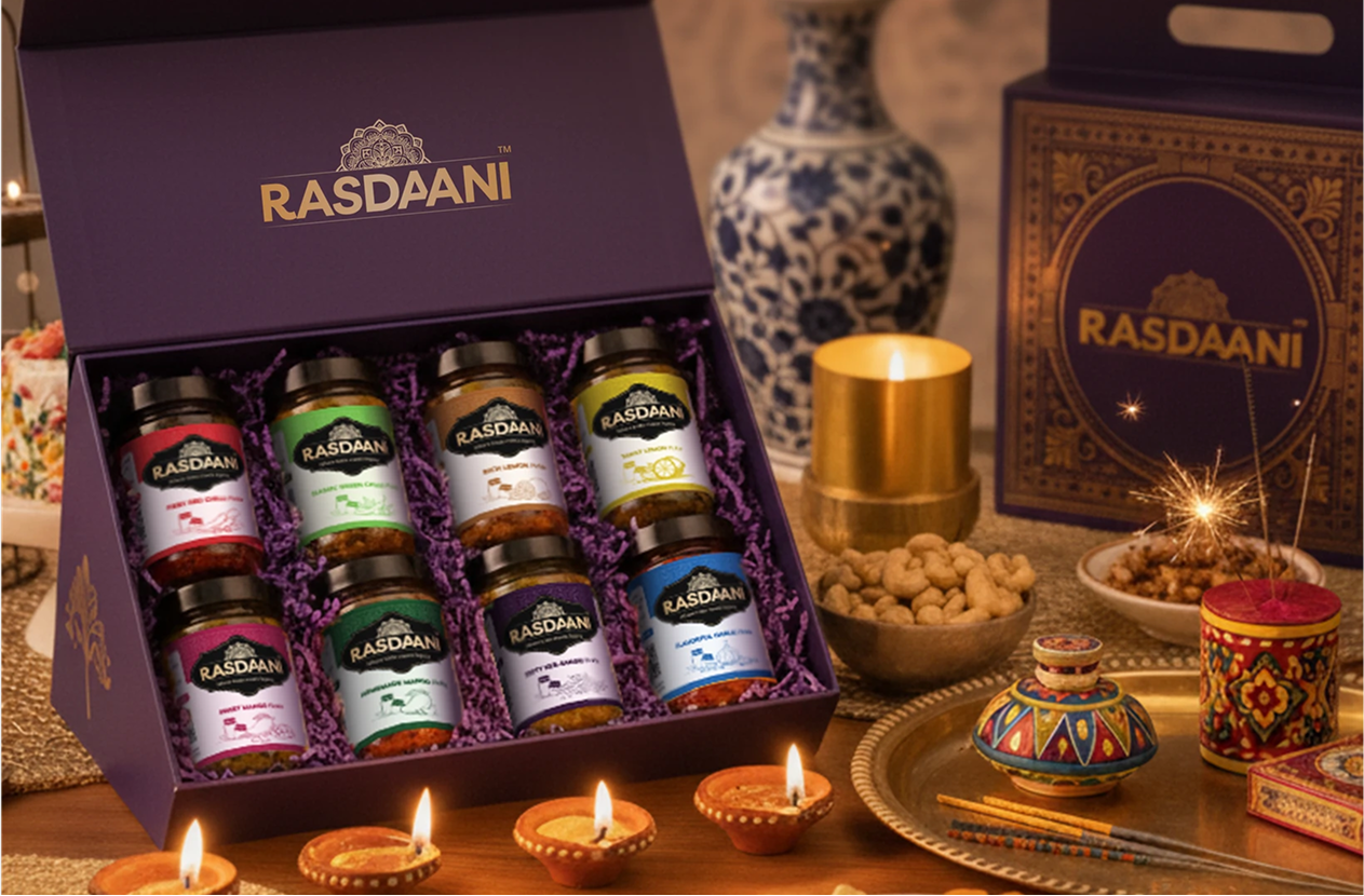
Colour & Differentiation: Deep blue with gold accents became the primary look for the flagship garlic pickle. Secondary colours were introduced for variants like green chilli, red chilli, and 5 other variants.
Packaging Design: I refined the jar label to include a clear hierarchy: brand name, flavour, key ingredient (e.g., “Garlic”) and a small illustration of the main ingredient. Photography was explored through AI-assisted imagery.
Impact & Growth
The packaging elevated Rasdaani’s presence online. Customers reported better recognition of the brand, and the consistent colour system made it easier for shoppers to pick their favourite flavour.
